Blog
BWC Rebrand: Digital Magic

It’s here! It’s here! The new BW Concepts brand is HERE…. eek!
I am thrilled to share with you the new look and feel of BW Concepts, all thanks to the amazing Jess and Justin of Apple & Anchor.
Why a Rebrand?
Do you ever look at something you use every day and think, “I can’t stand the way that looks anymore”? While my feeling wasn’t quite that strong, I had started to not love the BWC branding. It felt a little…old and outdated to me. When I founded BW Concepts, the business was just me, writing whatever I could for anyone who would allow me to. I wanted to look professional and put together, so the BWC fonts were formal and distinguished – which made sense then. But as the business has grown, the look and feel of the logos, colors, and tagline just didn’t seem to fit (kind of like last season’s jeans, amiright?). It’s not just me any more, BWC is now an awesome team that can provide so much more.
So, in short, the “why” is that this isn’t the same business as it was five years ago, and we needed a new vibe.
Who is Apple & Anchor?
You know when you meet someone, and you immediately know that you like them? That is Jess and Justin. I had the privilege of working with them on a client’s branding last summer and they were just so fun. Not only are they amazing at what they do, they make it exciting.
Creating a company’s brand is much more than logos and colors. It’s understanding the product, the customer, the pain points, goals, what’s working, what isn’t working…the list goes on and on. Then there’s the creative side; it can be really challenging to interpret what the client wants, and it can be exhausting to make it all come together. This is where A&A shines – Jess was happy to take feedback, ask follow-up questions, and bring fresh ideas – and always with a smile. So when I started toying with the idea of rebranding BWC, I knew exactly who to call.
Drumroll Please
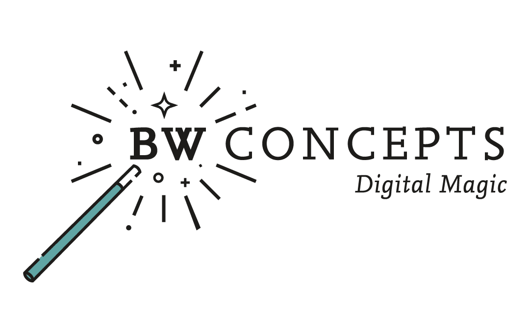
Here it is! The new brand for BW Concepts, Digital Magic.


What Changed
One part of our original brand was the tagline “content marketing.” I used it because I couldn’t think of a better way to describe all the services we offer in a quick line. But over time, I realized that the wording didn’t really translate to my ideal client; no one really knew what that meant.
Jess and I talked at length about the services BWC offers and who our clients are. I shared that the majority of our clients hand us their social, blogging, and newsletters, and we run with it with little direction. We just make the magic happen for their digital footprint, and they get to run their business. So when I saw the first draft of ideas included the tagline “digital magic,” I knew it was PERFECT.
Once the new tagline was set, it was off to the races. How did I never think of using a wand in the logo?! It’s genius. I love that the original teal color is still hanging out, but as more of an accent. And the new “desert sunset” color scheme is just dreamy, along with the mix of fonts. The combination is professional but fun, modern and memorable.
What Do You Think?
Let me know if you like it or if you love it! And if you’re thinking it’s time for a rebrand for your business, run to Apple & Anchor and tell them we sent you.
Be sure to check out the website refresh, too, courtesy of Hammersmith Support. I’m still playing with the color layout a bit so if you have a suggestion, let me know.


